Monday, August 1, 2011

Simple Guidelines to Hanging Drapes


I love the way drapes make a decorated room feel complete, but they must be placed well and suit the space to optimize the interior design, looking as lovely as possible. So how do you know if you’re choosing curtains that are the right size and placing them well? There are some basic rules of thumb to follow that can get you on the right track for hanging that finishing touch.

The height at which to hang a drapery rod depends on the style of window, window covering and the height of ceiling in the room.

HOW HIGH DO YOU PLACE THE ROD?

For standard drapes that hang on either side of a window creating a frame, the typical height at which to install the drapery rod is halfway between the top of the window and the ceiling. This applies if there are more than 12 inches between the window trim and ceiling. For a cathedral ceiling, try to leave approximately 4 to 6 inches above the window trim as a guideline. If your ceiling is low, consider installing the rod as close to the ceiling or crown moulding as possible. In a small room, hanging drapery panels as high as possible will give the illusion of extra height. DO NOT hang the rod so low that light shines through between the rod and the window treatment (I see this a lot with tab top curtains).

LENGTH OF DRAPES

Most drapes should just touch the floor to create an elegant look. In areas where you can't use functioning panels (ie: you have a bench or piece of furniture in front of the window), install roman shades for privacy and frame the window with floor-length drapery panels to achieve a “dressed window” look. Ideally, panels should go to the floor or in some cases stop at the windowsill, DO NOT install panels that stop anywhere in between.

WIDTH OF DRAPES

“Fullness” refers to the width of the finished panel. For more traditional drapery, fullness of 2 to 3 times the width of the rod will result in billowy, pleated drapery. Keep in mind that some fabrics hang differently than others. A sheer fabric might require more fullness, while a heavier fabric like velvet or chenille will only require a width of 1-1/2 to 2 times that of the rod. DO NOT hang wimpy looking panels it cheapens the look altogether.

TRICK THE EYE AND LET THE LIGHT IN

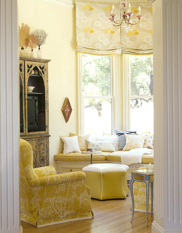
One of the best ways to make your windows look bigger and ensure you will maintain the most amount of natural light in your room is to not hang your window treatments more than 4 inches into the window (whenever possible).  If you are hanging panels be sure to mount your rod wide enough so that when your panels are open they are mainly covering the walls and trim, not the window itself.  When hanging a valance the same concept applies, the bottom edge of the valance should not fall more than 4 inches into the window. DO NOT hang valances level with the top of the window.

HALF-HEIGHT CURTAINS

For café curtains, install a tension or café-style rod halfway up the window, making sure the rod is parallel to the fixed horizontal mullion. This style of drapery should be installed inside the window frame for a finished look and should just touch the bottom windowsill. For a more tailored look, purchase or make curtains with a width less than 1-1/2 to 2 times that of the window. DO NOT let your treatment hang past the windowsill.

ROUND TOP WINDOWS

For round-top windows, hang the rod just below the rounded part, leaving the upper section of the window uncovered to let in natural light. Or, hang the rod over top of the entire window to emphasize tall ceilings and "frame" the special window with fabric. DO NOT hang your rod in the middle of your arch.


Thursday, July 28, 2011

Collections or Clutter?

Everyone collects things as a kid—stickers, baseball cards, stamps—but as we get older, either the items change to reflect a new aesthetic or the collections grow in size and value. But what makes the difference between a tasteful and well-curated collection and a room or house that looks like it’s straight from an episode of Hoarders?

The difference between a bunch of stuff and a beautiful collection is all in the presentation. How to display small items in a home is a big problem for a lot of collectors. Collections can take over a room or, in a worst case scenario, a whole house.  This mistake is compounded when the collection is of a mid-sized thing like figurines, pottery or books.  Somehow when a collection is of a dozen ducks from 8-12″ tall, you’re likely to find them scattered here and there, singly and in pairs, around the house.  Gather all the pieces of the collection in one place and evaluate the strength and interest of each piece. 


Another clever solution is to give a neutral-colored collection a colorful backdrop. On their own, the white vessels pictured on the right might induce a yawn. But group them together against green-painted shelves and their forms pop and become interesting.

Of course, shells are beautiful the problem is they can have a "been there, done that" look if they are simply lined up on a shelf or (worse) stacked in a bowl. Use small display stands to turn shells (and other natural wonders) on end and elevate them. They go from dust collectors to sculpture in one easy move.


A collection of vintage bottles works perfectly on a large windowsill.  Casually group like colors and make sure there are a bunch of different sizes for an unfussy look. Bonus- the light streaming through these bottles will brighten up the whole room.


Don’t hide beautiful platters or serving dishes in kitchen cabinets! Instead group them together and display them on kitchen shelves. Not only are they easier to access, it creates a great focal point in the kitchen.


Edit ruthlessly if necessary and just place your best pieces – all in one place…… one or two tabletops, or throughout one bookshelf.  If the collection is of small items, gather and anchor them together on a tray.  If the collection is of oversized items, group them in pairs or trios and place judiciously around the room.  If it starts to feel like a store, edit some more.

Wednesday, July 27, 2011

Hang your pictures...PERFECTLY!

For the most part I don't walk into places, my friend's houses, and mentally critique their decor (well it does happen sometimes, but only if it is really bad and those people aren't usually my friends...cause I would have already told them what was up), but one thing that I see all the time that drives me crazy is artwork that is not hung at the right height.  Men tend to hang stuff WAY too high and women...well that goes either way. 

So here is a great tip that will make picture hanging a simple, pleasurable task. The tip is to always hang your art at 65" on center. "On center" means that the middle of the picture is at 65" (obviously, the hook will be higher). Interestingly, the 65" standard represents the average human eye-height and is regularly used as a standard in many galleries and museums.

If you stick to this standard, you create a harmony among ALL the pictures in your home, as they will always hang in relationship to one another from their centers, not their sides. Additionally, I have also found that this helps solve the problem many people have, which is that they hang their pictures too high.

Step By Step:
1. Measure and lightly mark 65" on the wall
2. Measure top of your picture to the middle (or take height and divide by 2)
3. Measure top of your picture to the tightened wire (a small amount)
4. Subtract this last amount to tell you how far above 65" your hook should go
5. Measure up from 65" with this last amount and lightly mark on the wall

Example:
1. Picture is 20" tall
2. Middle is 10" down from top (this should rest at 65")
3. Wire comes to 2" below the top
4. 10" - 2" = 8"
5. Lightly mark 8" above your first mark OR 73" on the wall

Though this may seem complicated to read, it is quite simple when you do it. The thing to always remember is that the CENTER of all your pictures are hanging at the same 65", and you are just figuring out where the hook goes above it.


The artwork in this picture is hung about 12 inches too high,
while the collage is interesting, it looks like it is hung on the
vertical center of the wall (not good)

This 65" also applies to groups of pictures. Think of a group as ONE picture. After you arrange how you want them all to hang (doing this on the floor makes it easier), start with the center picture/pictures and get them at 65" on center. Then surround them with the rest of the group.

One except to this rule is if you’re hanging art over a sofa, table or chest, the bottom of the art should be 4-8″ off the furniture.

Check every picture and painting in your home and rehang them………..lower.


Tuesday, July 26, 2011

Easy Stripes on Textured Walls

As much as I love a beautiful painted wall in a single color, I also adore the look of painted stripes on walls.  They can be bold or subtle, symmetrical or varied, horizontal or vertical, but done just right, stripes are perfect for creating big impact on a budget.

Designing, measuring, and prepping your space for stripes is difficult enough, but the greatest frustration felt by most is taking the time to paint stripes around a room with textured walls, and then peeling off the tape, only to find uneven lines.

The best way to get a crisp line is to first paint your lighter color on the whole wall and let dry for an appropriate amount of time (or, if you’re painting stripes over an existing paint job, make sure you have the original paint color, at least enough for touch ups.)

Lay out your tape lines, then seal the edges of the tape with your ORIGINAL color using a brush or roller.  Let dry, then paint your contrasting stripe color over that, and remove the tape while the paint is still a bit wet.  Not only will you get a clean stripe, but the only seepage you’ll get is in the original paint color, and should blend in just fine.

Happy striping!

Monday, July 25, 2011

Top 10 Reason to Hire an Interior Designer

You might think that hiring an Interior Designer is only for the rich and famous, but actually hiring an Interior Designer is a smart way to go at any budget.  Here are some of the tops reasons.

1.  Hiring an Interior Designer will save you money.    How many times have you purchased something and have no where to put it, or purchased something and it doesn’t fit or look quite right and you end up getting rid of it shortly there after?  Hiring an Interior Designer can help save you money by suggesting purchases that will work and fit into your home decor.  A Designer will help you purchase quality items that will last longer and can transition with moves or changes.   Designer’s also have trade access and discounts that are often passed on the client, so you can purchase higher quality items for the same or lower than you would pay buying retail.  An Interior Designer can help you get it right the first time.

2.  An Interior Designer has access to trade only showrooms and products.  Buying retail is like have a choice of vanilla, chocolate, or strawberry ice cream.  But buying through an Interior Designer opens the world to a whole rainbow of colors.  When you purchase through an Interior Designer you have access to a fabulous world of fabrics, furniture, and other products that cannot be found in retail.

3.  Designers have an array of associates.  One of the biggest challenges facing homeowners and business when deciding on a new project or remodel is how to find quality craftsmen and trades.  Designers work with the trades daily, and they often know the best of their craft, from general contractors to upholsters to custom woodworkers, a Designer has contacts that will help ensure your project is done professionally.

4.  Coordination and Project Management.  Projects such as renovations and remodels can involve a lot of different processes and a lot of different people working on the same space.  A Designer has experience coordinating such projects, and can facilitate the work flow and timing of the installation.  A Designer can also act on your behalf to manage and oversee the project, and ensure that the work is proceeding according to schedule and most importantly correctly.

5.  Fresh ideas and perspective.  Sometimes it doesn’t matter how talented you are and how good your taste is, when you live in a home for a while, you can lose the ability to have an objective perspective.  Bringing in a Professional can give you a new and fresh perspective of the space.

6.  You’ll get more use out of your furniture.  A Designer can help you make quality choices in furniture that will last decades.   With such quality and classic pieces, you may only need occasional reupolstering to refresh your look.

7.  You’ll get more use out of your space.  A Designer can help you get more use of out of your space by designing a space that is functional and useable as well asesthically pleasing.

8.  Free marriage counseling!  Some couples have differences of opionions and tastes when it comes to buying something as simple as a couch; image the complications that arise when redoing a whole room or renovating a home.  Hiring a Designer can help find keep your marriage sane, by offering an outside perpective and recommeding materials that you will both love.

9.  You’ll have more time to do the things you love.  Let’s face it not everyone loves designing and buying for their home.  Hiring an Interior Designer will allow to you avoid the things you dread, and move on to enjoy the things you do love.

10. Your home is still not done.   And it may never get done!  Give your home the priority it deserves.  Bringing in a Professional Interior Designer to get those rooms and projects done once and for all, and enjoy your home the way you dreamed it to be.

Wednesday, February 23, 2011

A Modern Spin on Traditional Artwork


I guess President's Day in combination will all the history homework my daughter has been bringing home from school this month has sparked an interested in me to have sillhouettes made of my children.  You know, the very traditional black and white profile bust pictures typically in a black oval frame.  I remember seeing them all the time as a child, usually in homes belonging to friends of my grandmother's or Victorian styled homes. 

While I like the simplicity and traditional-ness (like my new word?) of the original sillhouettes, I don't have a traditionally styled home.  So that got me searching and researching...I wanted to find a sillhouette maker that could give a spin on a timeless artform. I also wanted to know the history of sillhouettes. Sillhouettes date back to the 1700s in France but really became popular in America in the 1800s.  These profile views are cut free-hand by artists, but now with technology a lot of the sillhouettes are computer generated.

Apple Blossom Print
In my search for an updated verison of the orginal Sillhouette I came across Apple Blossom Print (on www.etsy.com of course). These pieces have the traditional-styled sillhouettes with added colors, words or styling. I love the idea of adding color and your child's name to background of the artwork.      

There are very few things in life that are more precious than the profile of our sweet babies. And I don't know about you but time seems to be flying by way too fast! Lately I have been constantly trying to stop my cuties from growing, and getting bigger.  This is one way I can freeze my little loves ones in time.

Tuesday, February 8, 2011

T Minus 6 Days and Counting


"Saint Valentine's Day, commonly shortened to Valentine's Day, is an annual commemoration held on February 14 celebrating love and affection between intimate companions.  It is traditionally a day on which lovers express their love for each other by presenting flowers, offering confectionery, and sending greeting cards (known as "valentines")." - Wikipedia

With less then 1 week until Valentine's Day I have been racking my brain for ideas for my Valentine.  I want something that will make him think of me when he sees it.  Jason is not a "jewelry-kind-of-guy" so watches and such are out of the question.  I don't want to get him something generic...I want it to be personal, and loving all things home decor, I would like it to be something we can keep out year-round.  So after doing some research, this is what I found...

Personalized Heart Hand Carved on Old White Rustic Reclaimed Wood

I love the idea of this...a handcarved expression of love between you and your significant other.  The Lonely Heart can personalize it as you see fit, your initials, your wedding date, a special saying between the two of you, you decide!


This pillow from Alexandra Ferguson cracks me up! I am not sure you could use it on your family room sofa, but it would be great for the bedroom. 

Custom Coaster Set - 4 pc.

I don't know about you, but my mom always made us use coasters under our glasses! These fun and persoanlized coasters from Biscotti Beads are another great way to display pictures of you and your cutie throughout the house.

PERSONALIZED GIFT for Mother's Day- Photo Letter Blocks- set of 4- LOVE

I love these personalized and hand painted blocks from Mleefipps. What a great way to showcase the two of you as a couple. 

I LOVE YOU TO THE MOON AND BACK SIGN, Primitive Sign, Cottage Decor, Wedding Prop, Baby Shower Gift, Valentines Day Gift

Isn't it true! The way we feel about the one we love is hard to express with words, but why not try! This cute sign from My Primitive Boutique is a great way to tell your guy (or girl) how you really feel about them!

family date plaque

Men are so proud of who they are and where they come from, so why not show him how proud you are to be part of his family...and what better way to do that then let everyone know! Have a plaque made from The Country Mouse with your family name and the date it was established, I promise he will feel honored!


Every year the focus of Valentine's day is on the women...or once you have kids it sometimes shifts to them...so this year, why don't you go out of your way to make it special for him!


PS-
I would love to hear what you plan to do for your special someone! Let me know if any of these ideas work out for you! Plus I could always use other great ideas for futures "I love you" gifts!

Thursday, January 27, 2011

One of A Kind!

I love art! Not prints and the stuff you see everywhere, but true, one-of-a-kind, says-something-about-the-artist kind of art.  I am constantly looking for unique pieces, stuff you won't find at your neighbor's house, and if I can work with an artist to personalize it...even better!

So while I was endlessly and unsuccessfully searching the internet yesterday for a unique media console for our family room I came across an amazing artist! I was so drawn to his artwork that I spent at least an hour (while I should have been cooking dinner for my kids) looking at his endless pieces of art, all unique, all one-of-a-kind. I was so inspired by his talent I emailed him and asked him to call me so we could discuss a possible project. Within 15 minutes we were on the phone discussing his work and my desire for one of his personalized, amazing creation!

The artist is Rick Cheadle. He is based out of Detroit, Michigan, near my old stomping ground, and he is truly talented. He typically paints on furniture, table tops, birdhouses, sculptures, clocks, mobile, logos, t-shirts and more! He paints with vivid color and eye-tricking techniques.  One of the things I love about his work is that he paints thousands of tiny circles together to make one larger, unified object.

It has now been less that 18 hours and we have a plan in the works. I have commissioned Rick to paint a piece that I will showcase above our fireplace.  He is creating a "Family Tree" for us with strong roots and branches, and vivid, happy colors. Additionally, I have asked Rick to incorporate the first letter of each of our names into the design (J,A,C, B, and B) to signify the importance of each member of our family and how they play a part in our family.  I also asked him to add a peacock for a bit of whimsy and a nod to my grandmother.

I am so excited about this project that when I talk about it, I get a little giggle in my voice!  I can't wait to see it! And the added bonus to the whole thing is he is FAST! He is starting it today and I should have it by the end of next week.  I will post a picture as soon as I get it! So keep your eyes peeled!

Friday, January 21, 2011

Design Trends 2011 - Trend #11 Change It Up!


I have a dear friend, who every time I go to her house (which is once a week) she has moved everything around! Other than a few accessories that she changes out every-so-often, for the most part the items in her house are the same…just moved around! And I am not just talking about a couple of accessories; I am talking about furniture, art, lamps, even place settings in the hutch! She knows how to re-vamp her house without spending ANY money!

The key to being able to change it up and really see the is to keep you base pieces (ie: sofa, dining table, main dishes, etc.), the pieces you are only going to purchase every 10+ years, keep them neutral and timeless.  And let the smaller investments like lamps, picture frames, chargers, and linens be for colorful, playful and trendy.  Also buy a couple of statement pieces like a funky shaped Bombay chest or a mirrored buffet.

This week when I went to my friend’s house she had her dining table set with leopard print glass chargers, white plates and blue and gold napkins. She accented the room with a leopard-shaded lamp and a piece of art that tied all the colors together.  In her music room she leaned an iron piece of art (that is usually in her master bedroom) up against the wall and hung various framed picture of her loved ones.

So I challenge you! Once a quarter change it up! Move your furniture around, move your accessories, even rehang some art. You will be amazed how much it changes the feel of your home.  Pieces that didn’t show up before are now standing out and making a statement!

Penne, I adore you and you truly are an inspiration!

Thursday, January 20, 2011

Design Trends 2011 - Trend #10 Things Are Definitely Looking Up


Domed Copper Ceiling with
 Embellishments and Chandelier


Faux Copper Leaf Ceiling
Design is casting the eyes upward. The ceiling will be embellished and noticed more as the "fifth wall," and may be painted or architecturally enhanced to play more of a focal point in a space.  You will begin to see metallic ceilings done with either paint or vintage-inspired ceiling tiles.  Adding to the lighting trend (Trend #9) a large, eye-catching chandelier will be paired with ceiling a medallion to add weight to the fixture and heighten its beauty.  Textured architectural embellishments such as 3-deminsional stencils will add excitement to an otherwise normal ceiling.
So keep your eyes open, and upward, for some awe-inspiring designs overhead!
3-D Stencil on a trey ceiling


Wednesday, January 19, 2011

Design Trends 2011 - Trend #9 Lighting


Pottery Barn Fixture

Lighting is one of the most essential aspects in home decorating and yet it tends to get ignored more than any other single element in an interior decorating scheme. Lighting can give the illusion of space and depth and comfort and emphasis. It draws the eye and can also be used to distract it. Lighting, when done correctly, can make a so-so room look phenomenal.

The importance of the right kind of lighting in your house cannot be overstated. What is the first thing you do when you get home in the evening? Switch on the lights, right? And what if you want to set the mood? Don’t you head towards dimming the lights? Having the right lights can proverbially make or break a home. Use the right lights to highlight your favorite piece of art or downplay a paint inconsistency that only your eye can see.

Light fixtures, if used in the right way, can transform the entire look of your home and it is definitely less expensive than a new coat of paint or even the husband-dreaded word, ‘remodel’!


Ikea Fixture

This year lighting is either going to make a statement or disappear.  You will see a lot of bold and art-like fixtures or out-of-sight recessed lighting.  When you are selecting lighting think about what you need it for, task lighting, ambient lighting, focal lighting or decorative lighting. Then decide it you want to make a statement or if you want it to disappear.  Finally, think about the reflections and shadows it will cask on your surroundings.

Remember, make a statement, have fun with it, and give them something to talk about!

Tuesday, January 18, 2011

Design Trends 2011 - Trend #8 Upcycling

“Upcycling is the process of converting waste materials or useless products into new materials or products of better quality or a higher environmental value.” - Wikipedia
Upcycled house goods will be even bigger in 2011, according to those at Etsy, the online marketplace for handcrafted materials. Look for plastic bags turned into bowls, wine bottles into mini lamps, wine bottle corks into cork boards , vintage silk scarfs into pillows, neckties into throw blankets, old barn wood used to make furniture and as the canvas for artwork, 1980s speakers into a sofa table and bike parts into clocks. A turquoise mini file box made with vintage record album covers by FreeStyle Gifts of San Francisco ($38, www.etsy.com/shop/FreestyleGifts) could be used for coupons, recipes and the larger sizes could be used for kid’s artwork storage.

We are seeing more recycled-content building and remodeling materials such as countertops and backsplashes, and reclaimed wood floors (Trend #4).


I am proud to say that we as a whole are really becoming more environmentally conscience. With all the vintage style, upcycling, and recycling, “going green” is more than just a short-lived fad!

Design Trends 2011 - Trend #7 Coming to a Wall Near You!

Can you believe it? After all those countless hours we have all spent peeling duck borders and fruit wallpaper from the walls of our kitchens and baths, wallpaper is actually making a comeback! In 2010, we saw one wall accents and recessed niches hung with graphic designed wallpaper the latest trend for 2011 is to wallpaper two, three and even four walls in a room. Fewer accent walls and more fully papered rooms are cropping up in homes and magazine spreads as of late, along with a handful of "mini trends" in wallpaper design. While we started to see some of these trends at the end of 2010, experts bet they'll pick up even more steam in the months to come.
Paintable Wallpaper-It's the perfect hybrid between painting a wall and wallpapering it, and for the non-committal decorators among us. Big box stores like Target and Home Depot, carry over thirty designs including Martha Stewart's collection.
Tone-on-Tone & Metallic -If 2010 was the year of large scale patterns, a wide range of colors and quirky, highly individualized designs, then 2011 is definitely dialing it back a bit. Think subtly bold designs, such as the textured, paintable ones mentioned earlier, as well as tone-on-tone patterns and shiny metallic (see Trend #6!!).
Fabric and Wallpaper Combos-This is a trend is popping up in all the interior design magazines issues of the New Year. Interior designer Windsor Smith used Bennison's Roses wallpaper and then covered the home's dining chairs in an identical fabric, in a feature for House Beautiful magazine, above. Interiors magazine's January 2011 issue features the same technique by designers Silvia Oliveira and Daniela Martins who matched window treatments with wallpaper in a bedroom they outfitted in Brazil.

So while the trends of statements walls of 2011 are still holding strong, wallpapering the entire room is making a comeback.  So keep your eyes peeled for the wallpaper that fits your style!

Sunday, January 16, 2011

Design Trends 2011 - Trend #6 Sparkle and Shine

First let me say, "Happy Birthday Lauri and I love you!" Today is my sister's birthday!

Now back to design...


Lately, I've really been embracing the trend of adding just a little touch of something metallic. A pillow here, a candle there...it gives me a happy feeling inside, like I am fantasy! I have an obsession with mercury glass and now that I have started searching for it, I am seeing it in everywhere, light fixtures, frames, candlesticks and dishes (which of course if faux mercury)!
Remember that old "foil" wallpaper from your grandmother's house? The stuff you may have helped rip off the walls when she redecorated? I do! Well it is BACK! Maybe not all over and definitely not the same colors, but yes metallic and in smaller spaces, in niches or on one statement making wall. The designs are better, the colors are current and you will be seeing it everywhere!


This decor used to be reserved for holiday decorating, but now we're spotting shiny metallics and even sequins year-round, in nearly everything from throw pillows and serving ware to tile and wallpaper. It's a nod to Hollywood Regency and sophistication. You only need a hint of metallic to make a bold, glitz-and-glam statement, so be careful not to overdo it!

Saturday, January 15, 2011

Design Trends 2011 - Trend #5 Kitchen Design

As 2011 arrives, a few design trends have emerged into the forefront of kitchen design. Particularly as the economy continues to improve, homeowners are expected to invest more money in their homes through remodeling, rather than buying completely new houses. Here are 5 top predicted trends for kitchen design in 2011:


Cork Flooring

1. Going Green
As we are becoming more aware of the impact their lives have on the environment, they look to more eco-friendly product options. This holds true in kitchens as well. Natural design options, like cork, bamboo, and reclaimed wood are experiencing a surge in interest, as well as decorating essentials like low-VOC paint and varnishes. Eco-friendly appliances like induction cooking and those with an Energy Star rating are continuing to be popular as well.

2. Hidden Surprises
Even while appliances may be increasing in size, new building trends and design technologies can allow them to be essentially hidden within a kitchen behind custom cabinetry. This provides kitchens with all of the regular functionality, but also with a truly seamless appearance that we are just beginning to be seen in kitchen design.

3. Sleek vs. Mod
Although some homewoners may desire to hide their kitchen appliances, another trend for 2011 kitchens is the continuance of the sleek and modern look. Most homeowners will do this with stainless steel appliances, and pair them with a darker wood cabinetry for a sophisticated appearance. A new trend in cabinetry that we’re seeing for 2011, particularly in kitchens with stainless steel appliances, is white cabinets and countertops. This combination creates open and airy kitchens while still retaining full functionality.

4. Multipurpose Room
Speaking of open and airy, kitchens have long been a gathering point for family and friends, especially during the holidays. The increasing number of multipurpose islands being created and installed in kitchens shows that more consumers are both cooking and gathering in their kitchens. Homeowners are also gravitating towards open floorplans, which allows the kitchen to be connected to a living or dining room, and provides even more space to cook and entertain.

5. Pops of Color
While it might feel a bit like a return to the colorful kitchen days of the 1950’s and 1960’s, one of the biggest trends designers are predicting for this season is for kitchens to include whimsical and often unexpected pops of color. Usually, these will come from appliances, like the traditional KitchenAid stand mixer in a bold cherry red hue. If clients express their wishes to include such bright bits of color, consider your material choices in the rest of the kitchen design and you can provide the ideal kitchen experience!